Mind the Gap
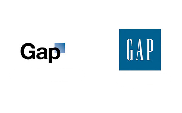
Just last week, The Gap revealed a brand new logo (top, left), one that was supposed to give the massive store chain a much more Post Modern and sleek look. The logo contained the signature three letter name of the store, but in a new font, and with a random blue half faded box slightly behind the letter P.
The image went viral, understandably so, seeing as how there are several million Gap customers out there who are online. But it didn’t spread the way the retail had intended. Within days, a website popped up where users were invited to protest the new logo by typing in whatever word they wished instead of G-A-P (check it out here). A fake Twitter account showed up too (it has almost 5,000 followers already), protesting the new logo. And in classic new age Social Media fashion, the tactics worked!
The Gap has announced that it is pulling the new logo, and reverting back to the same classic navy blue with white letters that it has sported for the past two decades. They broadcast the news on their Facebook page, stating “We only want what’s best for the brand and our customers. So instead of crowdsourcing, we’re bringing back the Blue Box tonight.”
So pat yourself on the back, Social Media users. This is just another small victory on the long road to taking power back from large corporations using tools everyone has access to.
 Posted by Luc in
